Three important qualities of an Ecommerce website that make your customers happy and facilitate conversions...
How To Build An Ecommerce Website From Scratch That Promotes Brand Awareness And Increases Profits
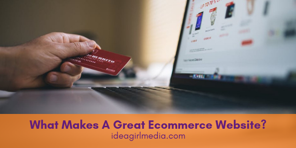
Ecommerce has removed many of the geographical limitations from buying and selling. People no longer have to live within local proximity to a store to obtain its products. But, as online retailers know, one of the challenges in Ecommerce is facilitating a great experience for customers using only a website.
Without the opportunity to interact directly in a storefront setting, it’s highly important to remotely meet and exceed shoppers’ needs.

So, what makes a great Ecommerce website?
Consider these parameters when you’re building your online retail business.
Prioritize Speedy Website Loading
There’s an increasing need for speed on the internet:
- Connections have gotten faster
- Google now uses site speed as a ranking factor
- People expect it
It is more than merely appreciating speedy site load times. Failing to deliver quick, convenient loading may result in potential buyers abandoning your website. And, every lost conversion represents a tangible hit to your bottom line.
So, just how fast is fast?
According to marketing expert Neil Patel, a business loses almost one-fourth of its visitors if the site takes more than four seconds to load.
Ideally, your Ecommerce home page should load in about two seconds. However, many online stores currently take around eight seconds. The best rule of thumb to remember is faster is better in terms of conversion rates and visitor satisfaction.
Create A Branded Look And Feel
So, what is an ecommerce business?
At its most basic, Ecommerce entails enabling customers to conduct transactions via your website. There must be a product catalogue and a payment gateway for this to work. It is very important to power your store with a platform that makes browsing and buying possible and EASY.
But there’s more to Ecommerce than just bare bones functionality...
Question: What differentiates one Ecommerce store from the next?
Answer: Branding.
The look and feel of your website, plus the personality you create through imagery and copy, all contribute to how site visitors feel about your online store. To stand out from the pack, it needs an identity. Your website’s design can then convey this “brand personality” to the world.
According to one branding expert, it’s beneficial to remember these four parameters when you’re creating a brand for your Ecommerce store:
- Voice: Voice incorporates both what you’re saying and how you’re saying it. Your voice should appeal particularly to your target audience.
- Visuals: Website imagery should match your messaging and voice for maximum impact, both on your website and on social media.
- Value: It’s important to convey the value your products or services can provide to customers in clear terms.
- Variation: Consider your brand’s unique value proposition as compared to other retailers. Communicate to customers why they should buy from your store and not from another within your niche.
Improve User Experience With Navigation
Customers can only add products to their carts and proceed to checkout if they can find what they’re seeking. Navigation is key in this regard.
Poor on-site navigation only leads to confusion and frustration, possibly diminishing conversion rate along the way. Smooth on-site navigation helps people find products quickly and without hassle, moving them along within the customer funnel toward completing their desired transaction.
There are two pitfalls to avoid:
- Displaying too much information
- Displaying too little information
For example, the Baymard Institute found “not displaying product categories directly in main site navigation causes multiple and severe navigational issues for users.” This goes to show it’s beneficial to think in a hierarchy. Always start broadly and work your way toward specific navigation links.
What Makes A Great Ecommerce Website Design?
For starters blend intuitive navigation and quick load times with a branded look and feel.
0 Replies

Like what you see? We've been told our blog posts are like potato chips: You can't read just one...
Subscribe to receive them fresh in your Inbox, and you can grab our best insights about social media marketing before everyone else sees it!

Relevant Resources
view allThe True Cost Of Letting Peak Sales Periods Pass You By

Three Surprising Signs You’re Still Silencing Your Female Employees
How Ongoing Training In The Workplace Can Drive Long-Term Business Growth









Leave a Reply