 In early 2011, I asked the question, “Do Ohio Elected Officials Kick Social Media Butt?” I extended an open invitation to all Ohio political candidates on the ballot for the November 2011 election to submit a guest post to help citizens become aware of their platform.
 In early 2011, I asked the question, “Do Ohio Elected Officials Kick Social Media Butt?” I extended an open invitation to all Ohio political candidates on the ballot for the November 2011 election to submit a guest post to help citizens become aware of their platform. That original post inspired a series of informational posts. This is the twelfth in the series on how Ohio Political Candidates can ROCK Their Social Media.
For those finding this post first, here are the first eleven ways:
- Your Blog is Your Social Media HQ.
- Groovy Graphics, Baby!
- Your Essential Social Networks.
- It’s Not Broadcasting!
- Draft to Win.
- Challenge the Electile Dysfunction.
- Enlist & empower social media-ites.
- Be Likeable AND Sendable.
- Tweet & Hash!
- Va…Va…Voom… Video!
- Online Etiquette - Social Media Manners.
So what would make this a groovy dozen of best practices??
The 12th Way Ohio Political Candidates Can ROCK Their Social Media:
Most people are attracted to Facebook because it is popular - a lot of people are already there. So this seems easy.
The mainstream thinking is, "You set up a Facebook Page, and off ya go!"
But it's indeed not that easy!
You have to put on a little charm in getting people to like your Facebook page. Because:
- There are now 677,000,000+ people on Facebook.
- There are many, many Facebook Pages.
- You compete with brands, nonprofits, and other public figures for the Facebook Like.
- Between the personal interaction, Facebook Fan Page updates and ads - there is a lot of noise!
How do you cut through all that noise on Facebook?
Be a welcoming online host.
No, I'm not suggesting you hand out bags of Skittles for every Facebook like. Nothing like that. 
I'm saying lay out the welcome mat, stand out from the rest, and make your Facebook Page worthy of a mouse click on the Facebook Like Button!
How do you do that?
Put a Welcome Tab on your Facebook Page.
And make it the default landing page so everyone that is not already a fan will see this first!
This is becomes another way to impress your constituents and let them know you care about their support.
Welcome Tabs can feature:
- Photos.
- Video.
- Your slogan.
- Email address capture.
- Links to other tabs or pages.
Are you thinking that this won't make a difference?
Remember: Every first time visitor will not become your Facebook Fan.
In fact, here are some statistics for you:
- Visitor to Fan conversions without a Welcome Tab: 23%.
- Visitor to Fan conversions with a Welcome Tab: 47%
That's like double!!
Your goal is to get an online visitor to click the Facebook Like Button. So something attractive and straight forward is best.
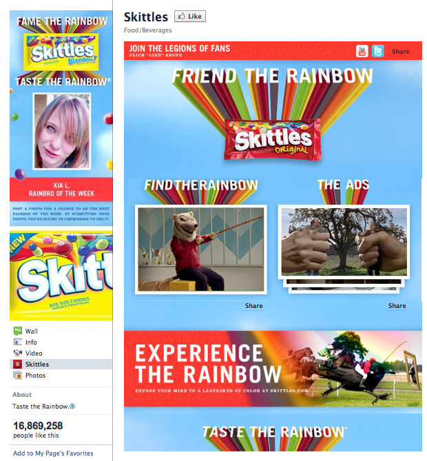
Speaking of Skittles - they have a pretty groovy Facebook Welcome Tab:
The view above is one a non-fan would see when they first reach the Facebook Page. Note their use of color, variety of options to engage the visitor, and the graphic leads the eye upward to the Facebook Like Button.
They also feature one of their fans in their left main banner image -- A great idea for those preferring more advanced options!
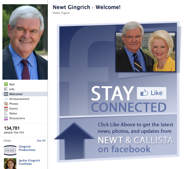
Comparing apples to apples, Newt Gingrich has been an example in previous articles.
Lets take a look at his Facebook Welcome Tab:
Straight forward, simple, and encourages the visitor to click the Facebook Like button.
No advance options needed, yet welcoming!
Did you notice that his Welcome Tab DID NOT include a "donate now" button?
I've seen this done. And honestly, I advise against it. It makes a candidate look greedy and unimaginative.
Lets put it this way:
Do you hold out a donation jar when someone rings your doorbell?
What questions do you have about Facebook Welcome Tabs?
Welcome Mat Image Credit: mailboxandbeyond.com
2 Replies

Like what you see? We've been told our blog posts are like potato chips: You can't read just one...
Subscribe to receive them fresh in your Inbox, and you can grab our best insights about social media marketing before everyone else sees it!

Relevant Resources
view allThe True Cost Of Letting Peak Sales Periods Pass You By

Three Surprising Signs You’re Still Silencing Your Female Employees

How Ongoing Training In The Workplace Can Drive Long-Term Business Growth


















Leave a Reply