Want to improve your online sales? Guest author, Jared Carrizales outlines 3 ways to efficiently design your eCommerce product pages with unique content to delight your customers and encourage sales...
A guest post by Jared Carrizales
How To Build-Out Awesome eCommerce Product Pages That Encourage Sales
A picture is worth a thousand words, but this denotes that there are trillions of words on the internet for eCommerce shoppers to sift-through. You want product pages that make site visitors want to purchase your products and also want to share your content with their friends.
For this to happen, you need your products to stand out in a sea of mediocrity. So, the answer is to build out your pages with unique content!
In this article, we'll go through some product page design best practices. Here are 3 ways to efficiently design your eCommerce product pages with unique content...
1. Video, Video, Video
Assuming you already know that video content is projected to account for 80% of all internet traffic by 2019, you need to realize something: that traffic isn’t going to be isolated to YouTube and social media. As an eCommerce host, you need to start integrating video into your product marketing strategy. Include explainer and product showcase videos on your eCommerce product pages.
Make sure your videos are state-of-the art. If you’re not skilled in videography, hire a production company - don’t skimp. You will make up for the money you spend in product sales. The goal is to create product videos that people can’t wait to buy and share. Use a site theme designed specifically for eCommerce and use add-ons to help you showcase your videos.
Use a Product Video Add-On
EasyVideo is an add-on for Shopify that will help you easily upload videos from YouTube or Vimeo to your product pages. It costs $5 per month and is easy-to-use.
2. Include Creative Buyer’s Guides
You want your customers to have all required information on one page so that they know what to purchase. Consumers want to know how clothing is going to fit, which length necklace chain will look best with a low cut shirt, what product option has the best features for their needs. So, you should include buyer’s guides on product pages.
If you don’t want your buyer’s guide to take up a lot of space, you can include a hyperlink that triggers a pop-up or a new window. But, the best buyers guides are beautiful enough to be embedded into the product pages - they are interactive and they make people want to use them.
Choose a Fashion Buyer’s Guide Add-On
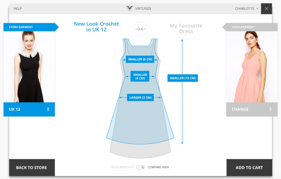
Virtusize is a fashion buyers guide add-on for Shopify that allows users to improve fashion customers' buying confidence with size, fit, and style guidance. This one costs $30 per month, and that’s because it boasts increasing average orders by 20%. Additionally, they claim to reduce return rates by 30%!
If you're in the business of selling clothing online, you may want to check out this tool.
Use an Internal Product Comparison Add-On
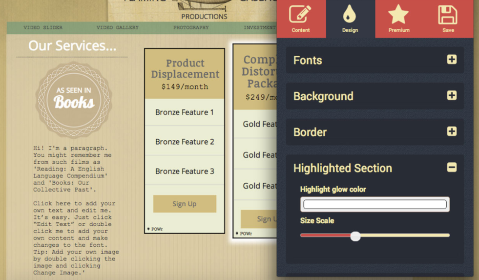
Price Table is a free add-on that allows you to showcase multiple products side-by-side. You can compare pricing, promote upgrades, or highlight your best offers. This is another tool that claims to drive sales and decrease returns.
Use a Product Discovery Add-On
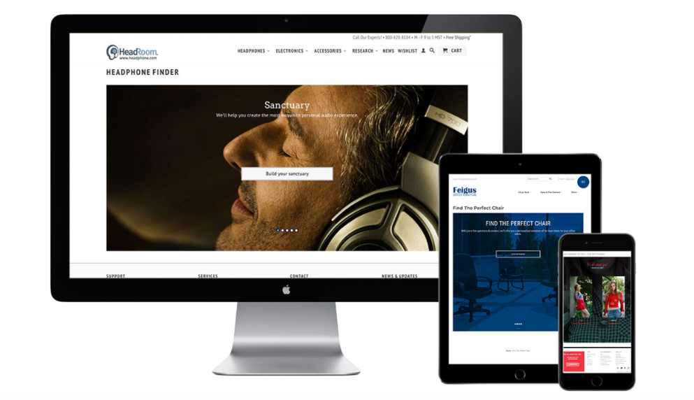
Guidelines Product Finders is an add-on that you can install for free and leverage pro features for $29.99. It helps shoppers find the perfect products every time and allows your website to have a one-on-one conversation with them. Drive sales through product discovery, advice, and gift guides.
3. Showcase Your Product in Real-Life Settings
It is tempting to use a product page template that quickly and simply puts your product on a page. However, this method gives your eCommerce product pages a generic look, and it is not very interesting to your potential website buyer...
Rather than only including images that show your product on a white background, use photos that display the product real-life settings. Think about these questions:
- Where does your target market like to spend time?
- What image would entice YOU to feel comfortable?
- How can you place the item in a setting that helps your customer understand you can solve their problem or meet their need?
When someone uses your product, are they: In the woods? At cafes? Cuddling up in a chair at home? Let them see how your product is going to look and feel when they are out using it, living everyday life.
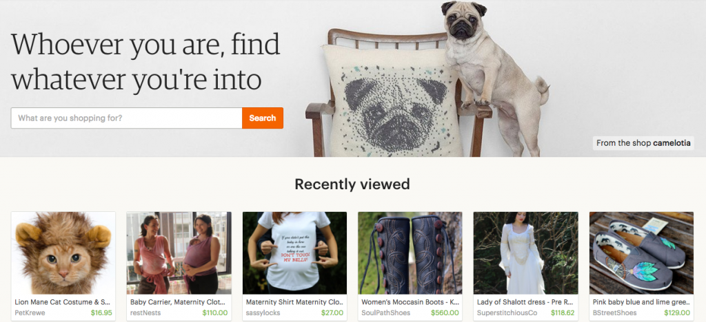
If you need ideas, check out Etsy. Their site is full of the most creative product images from artisans all over the world. Many of the images on Etsy’s site showcase handmade and vintage products in real-life settings. This company is known for unusual and creative content.
There is actually an eCommerce add-on for Etsy as well, if you need to cross-promote.
Conclusion About Effective eCommerce Product Pages
When you want to create product pages that stand out, follow these guidelines:
- Create exceptional videos
- Include interactive buyer’s guides on the same page with products
- Include content that shows more than just a piece of your inventory sitting in a boring background
Those three things will lead you toward success with your eCommerce product pages.
As you become more experienced, you may find that you come up with your own product page design template and/or product listing page design, using some of the resources above.
What other tips have you learned about building eCommerce product pages?
Please share them with us in the comments. :)
 Author Bio
Jared Carrizales leads the marketing efforts at Heroic Search, a content marketing and link acquisition agency based in Dallas and Tulsa, working with small brick and mortar stores to large international companies. In his spare time, Jared enjoys reading, and playing tennis. Follow Jared on Twitter.
One reply

Like what you see? We've been told our blog posts are like potato chips: You can't read just one...
Subscribe to receive them fresh in your Inbox, and you can grab our best insights about social media marketing before everyone else sees it!

Relevant Resources
view allThe True Cost Of Letting Peak Sales Periods Pass You By

Three Surprising Signs You’re Still Silencing Your Female Employees

How Ongoing Training In The Workplace Can Drive Long-Term Business Growth





Leave a Reply