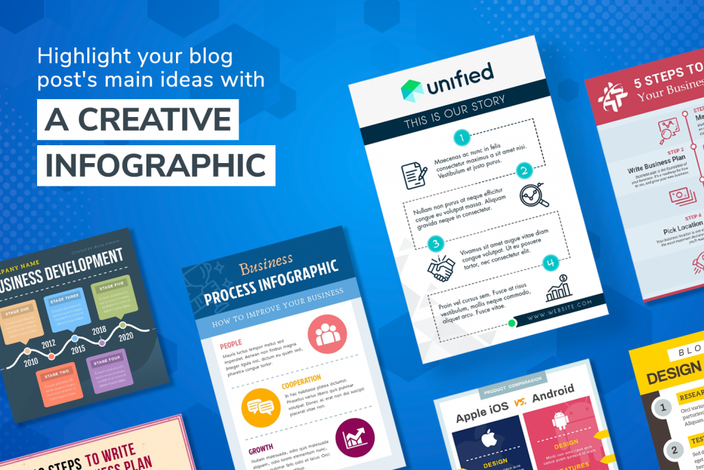
Every blogger's dream is free marketing graphics.
Every blogger's dream is free marketing graphics. Which is possible much of the time, if you are clued in to good image editing secrets. Here we give you a savvy tool tip and cost-effective ways to outdo others in your niche...
Digital Marketing Graphics For Business
Start browsing online and you’ll find there’s a blog dedicated every topic. Even specifically niche themes too. So you will always be up against hundreds, if not thousands, of similar blogs vying for a slice of the readership pie.
One factor can differentiate your blog from the rest in a generation characterized by short attention spans: High quality visual content. Marketing graphics that go inside your blog article text and on your social media.
How to create the best marketing graphics for your blog? In this article, we dig into details about creating engaging blog graphics. We'll go through:
- Images
- Colors
- Designs
And other aspects to make your posts more shareable on Facebook and other social media sites.
Start At The Top - How To Create Engaging Blog Headers

The importance of headlines cannot be understated. Whether your goal is to grow a target audience or make a sale, the headline determines whether or not the reader continues. Your content hinges upon a good headline and subheadings.
Keep the following in mind when developing headlines:
- Use a typeface that is easy to read.
- Use appropriate and high-quality stock images.
- Use alt text for your header to maximize SEO.
- Utilize resources that will help you develop unique headers.
Let's dig a little deeper...
Choosing The Right Typeface For Your Header
There are two areas you need to consider when choosing the right font:
- How easy is it to read? Avoid fonts that use cursive. Fancy elements are typically harder to read and could turn the reader away.
- Choose something impactful
San-serif fonts like:
- Roboto
- Oswald
- Lato
Are all great options available in most graphic editors.
The "serifs" are the little lines on the end of each letter, meaning that they are easier to read with smaller typefaces. However, you want something easy to read. So, you may want to stay away from a smaller typeface for some marketing graphics.
How To Choose The Right Stock Images For Your Blog
Your goal is to select an image that will enhance the text of your post. The photos need to be relative and high-quality. Websites like Pexels and Pixabay are two great options offering royalty-free images.
If you have the option, use high quality images you have taken yourself with a DSLR camera.
- Travel bloggers
- Cooking and culinary bloggers
- Lifestyle bloggers
All need to provide an authentic "slice of life" perspective.
Establishing yourself as authentic really cannot be done with low resolution images or blurry photos. Use high quality photos or stock graphics that really add to your blog’s narrative.
Creating Blog Headers That Work
If starting with a first blog, research is essential to discover the best design elements. See what other blogs in the same niche are doing. Look at those posts and graphics and ask yourself how you can set the bar higher.
You might find that many blogs don't have image-based headers or their image-based headers are randomly inserted stock graphics that have little to do with the blog post topic. This gives you a unique way to stand out.
Remember to include alt tags with every image to ensure those who cannot see the images will know what each blog article is about.
Creating Stellar Infographics
Now that we've gone past the header, we can dig into the body text. In this case, "text" will be a bit generous as we move onto the next crucial graphical element: Infographics.
If you want to create custom infographics, keep these things in mind:
- Perform in-depth research on engaging topics.
- Always cite your sources.
- Make them easy to read.
- Use a platform that simplifies the creation of Infographics.
Let's dig into the details below...
How To Research Like A Pro
Writing is:
- 80% research
- 15% writing
- 5% coffee breaks
Before you start writing, your goal is to have a solid understanding of the topic. Taking shortcuts here will show through in the quality of your writing.
Follow these tips to research like a pro:
- Research on topics that people are actively searching for in your niche.
- Use data from reputable websites that are not your competition.
- Hyperlink your data back to the reputable websites.
- Use measurable data sources.
- Search "your niche" followed by "statistics" on Google if you are struggling.
When linking externally, provide your data upfront, giving the reader no reason to move the linked site. Given that 77% of internet users read blogs, it is an audience you have the potential to capture with the right techniques.
Creating Engaging Easy-To-Read Infographics
Good content is engaging and easy to read. As a blogger, you need to consider this to be a main view of your business. One way you can legitimize your business is by creating an infographic.
While you can use excel for data gathering purposes, it doesn't produce the shareable infographics you typically see on Twitter, Instagram or Pinterest. To garner attention and create a more appealing message, you need a piece of content that appeals with good design.
Not all of us are design professionals. You may need a tool to produce quality visual content. PosterMyWall is a graphic editing tool that takes the complicated design process and simplifies it. By choosing a pre-made template from their site, you can feature your data in an engaging format.

Make Your Content Skimmable With Imagery And Marketing Graphics
As of 2015, approximately 43% of people admit to skimming blog posts. For example, take a look at Twitter. With 280 characters, their unique strategy allows them to compete with Facebook. They used to allow only 140 characters, which affected user attention span.
In the case of blogs, you have multiple ways you can effectively keep readers' attention. The first is to add visuals to your text.
We've already discussed the importance of infographics, but other forms of graphic content can be a great addition. You can make graphics in appealing formats for:
- Testimonials
- Quotes
- Lists
Below are a few other examples:
- How-to articles can include photos or a video of the process.
- You can include screenshots if the article involves technical help.
- If it is a travel blog, show off your trip photos.
Branding: Use Consistent Color Combinations For Marketing Graphics
The last step comes from the usage of color combinations. This is easy to overlook, but the color of your blog takes a branding effort.
Clashing color combinations make your blog less unappealing. When choosing the color of your blog your color choice should be:
- Easy to view (no lime greens or other eye-straining hues)
- In contrast with the text
- A complement to your current brand scheme
If you need to choose a new color, choose one that positively enhances your brand voice.
How Colors Affect Emotional Experience
The next time you enter a room, take a look at the walls. Ask yourself how that color makes you feel. The same logic applies when you look at a website. When selecting a color for your brand, keep in mind that different colors result in different emotions.
This emotional change is known as color psychology. Below are a few colors you should keep in mind:
- Red is a bold color that inspires passion. It can project an image of power.
- Blue is the color of leadership, stability, and overall calm. Lighter colors in this spectrum can put people at ease.
- Yellow is a color of overall happiness.
- Black is powerful and mysterious. It represents leadership but can sometimes feel a bit too serious for some.
- Silver is a color often associated with innovation. Think of any “futuristic” cartoon, and you get the idea.
Not all of these colors trigger those emotions 100% of the time. Recognizing that colors can result in specific emotional responses allows you to plan and get feedback.
Final Thoughts On How To Make Marketing Graphics
The stories you tell on the blog are important. With the inclusion of:
- Header graphics
- Infographics
- Other marketing graphics
Your blog will have an additional personality level. Putting a focus on easy-to-consume skimmable content, readers are more likely to take action on any service you may be offering.
Even if you don't have a specific strategy yet, you give yourself a great start by creating an engaging experience. The right images make your content much easier to read, creating a better experience.
7 Replies
-
Pingback: Graphic Design Tips For Your Business Marketing - TechGeek365
-
Hello Keri, Glad to see that you reply everyone. Actually the ideas and some tactics about the marketing of graphics really liked by me which you presented here very nicely. Thanks a lot, I learned a lot from your post.
-
Very informative! Learned so much from this article.. Thank you very much!
-
thanks for sharing this article. It’s very useful to me. Last some days I was looking for the tactics to start a blog writing.
-
Hi Keri. Thanks for sharing this article. It’s very useful to me. Last some days I was looking for the tactics to start a blog writing. Because I love to writing. But in this post I learn about a new thing. The tool and Digital Marketing Graphics idea are awesome. This article really very effective for my work.
Leave a Reply

Like what you see? We've been told our blog posts are like potato chips: You can't read just one...
Subscribe to receive them fresh in your Inbox, and you can grab our best insights about social media marketing before everyone else sees it!

Relevant Resources
view allThe True Cost Of Letting Peak Sales Periods Pass You By

Three Surprising Signs You’re Still Silencing Your Female Employees

How Ongoing Training In The Workplace Can Drive Long-Term Business Growth


By Arutars IT Farm on